display_split_screen()
Displays two side by side components that can be any component type: informative or call-to-action.
For the examples below, an informative screen on the left is being used to display information about some object/process that needs to be completed/identified. The call-to-action (CTA) component on the right is used in your app to guide users towards your goal.
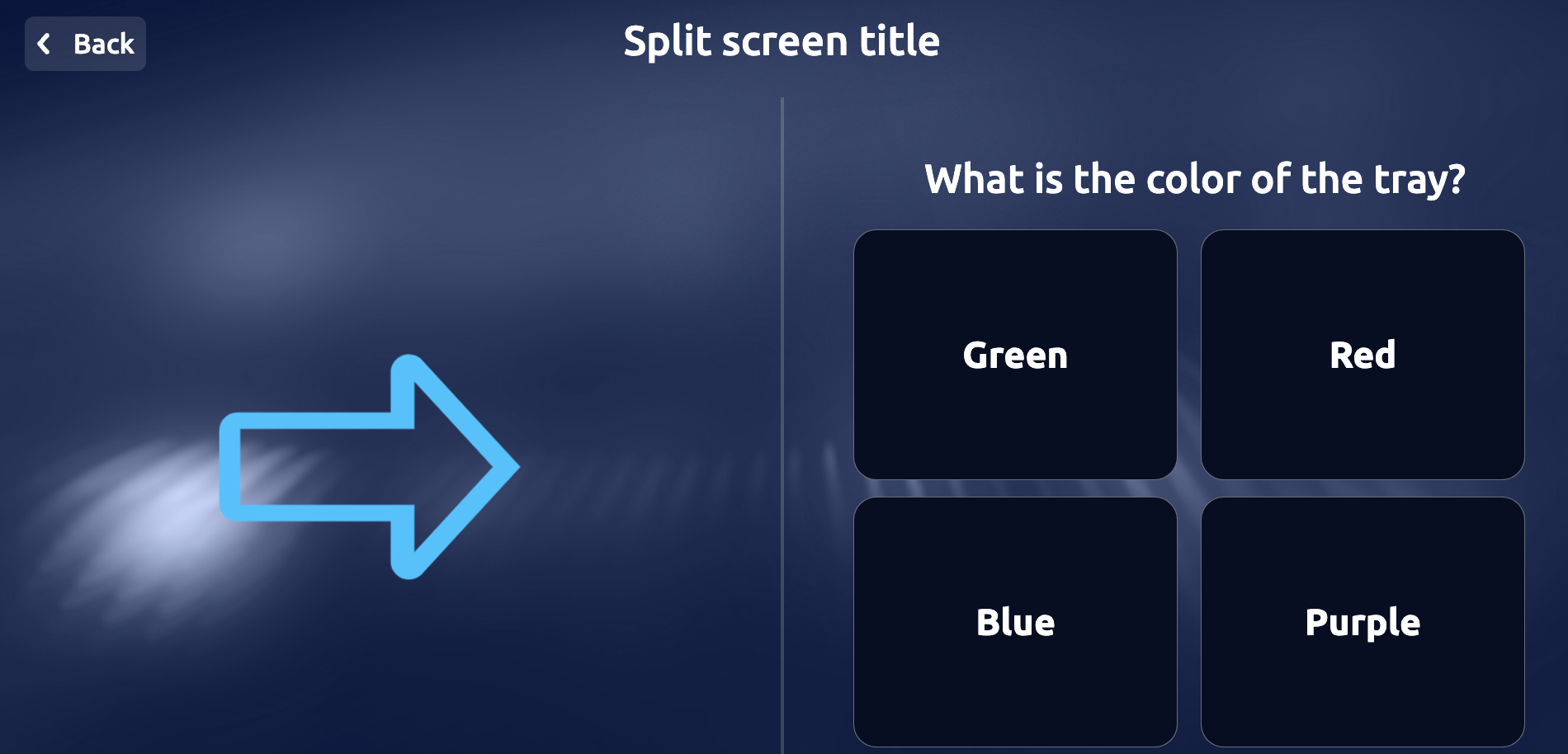
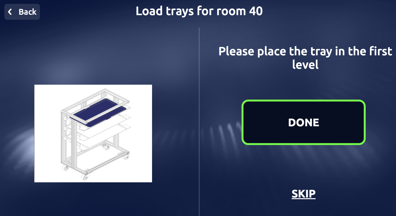
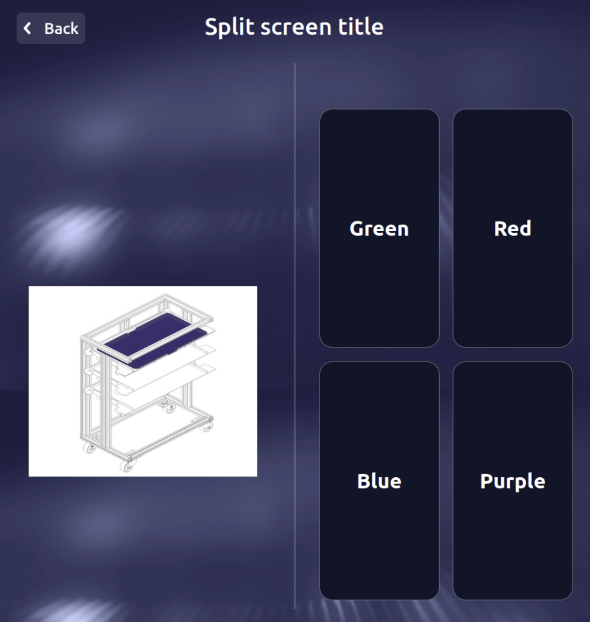
It’s the perfect method when the user needs to view a figure, and respond with a click or real-life action in order to follow your design process, or when two animations/selection screens need to be displayed at the same time. Some of the most popular usages for this component is the ‘Instruction’ screen in which the user is prompted to confirm a reference task like ‘load this tray’ before continuing. Another popular use is asking the user to identify a visual that would help the robot complete its task.
Reference
Explore more about this component here
Arguments
Arguments |
Type |
Default Value |
|
|---|---|---|---|
title |
string |
Title of the screen (mandatory) |
|
title_size |
enum |
|
Size of the title |
theme |
enum |
|
Enum representing the theme of the screen (WHITE or DARK) |
first_component_type |
enum |
None |
First element to show, check |
first_component_data |
dict |
None |
Dictionary of data for the first component (data types dependent on component type) |
second_component_type |
enum |
None |
Second element to show, check |
second_component_data |
dict |
None |
Dictionary of data for the second component (data types dependent on component type) |
show_icon |
bool |
True |
Show icon in the modal |
back_button |
bool |
False |
Show back button |
button_size |
int |
1 |
Button size (1 = SMALL, 2 = MEDIUM, 3 = LARGE) |
custom_style |
dict |
None |
Dictionary containing custom styles for the split screen (optional) |
languages |
list |
None |
List of languages to be displayed on the screen (optional) |
chosen_language |
str |
None |
If list given, string representing chosen language |
wait |
bool |
False |
bool indicating whether to wait for a user response (optional) |
callback |
callable |
None |
Callable function to handle the response (optional) |
Return
Dictionary that contains the action performed by the user.
{
     "selected_option": {
         "id": 2,
         "name": "Red"
         },
     "action": "item_selected",
     "app_id": "doctest"
 }
Exceptions
RayaUIMissingValueRayaUIInvalidValueRayaNeedCallback
See the complete list of ui exceptions and the complete list of general exceptions.
Callback Arguments
callback
Argument |
Type |
Description |
|---|---|---|
data |
dict |
Dict containing the result of the action |
Example
...

class RayaApplication(RayaApplicationBase):

    async def setup(self):
        self.ui = await self.enable_controller('ui')
        ....

    async def loop(self):
     ....
        response = await self.UI.display_split_screen(
            title = "Split screen title",
            first_component_type = UI_SPLIT_TYPE.DISPLAY_ANIMATION,
            first_component_data = {
                "type": "URL",
                "url": "https://fms-s3-dev.s3.eu-central-1.amazonaws.com/WhatsApp+Image+2023-02-10+at+12.38+1.png"
            },
            second_component_type = UI_SPLIT_TYPE.DISPLAY_CHOICE_SELECTOR,
            second_component_data =  {
                "data": [
                    {
                        "id": 1,
                        "name": "Green"
                    },
                    {
                        "id": 2,
                        "name": "Red"
                    },
                    {
                        "id": 3,
                        "name": "Blue"
                    },
                    {
                        "id": 4,
                        "name": "Purple"
                    }
                ],
                "theme": "DARK",
                "title_size": "SMALL",
                "max_items_shown": 0
            },
            wait = True
        )
        self.log.info(response)
      ...

    async def finish(self):
      ...

...

"""
When the "Red" button is clicked it will show:
{
    'selected_option': {
        'id': 2,
        'name': 'Red'
    },
    'action': 'item_selected',
    'app_id': 'doctest'
}
"""